Creative Movie Poster
2021 Rexburg, Idaho
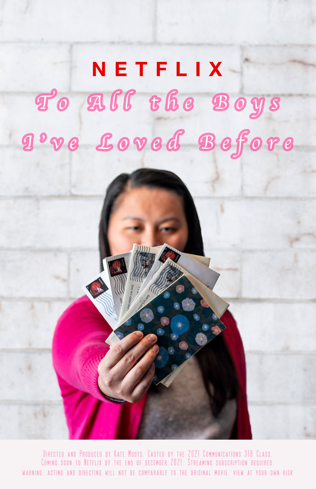
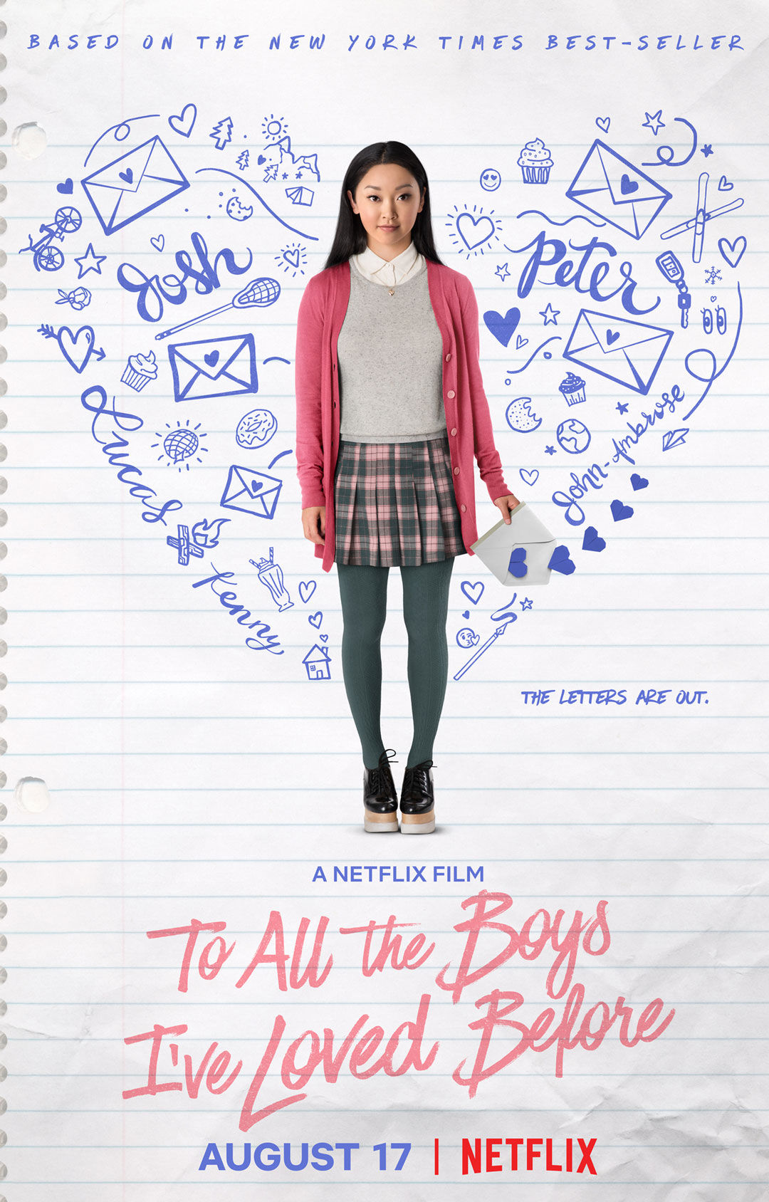
On the road to my Communications degree, I took a class called Professional Imaging. One of the projects we worked on had us use our Photoshop skills along with our camera skills. Below is the finished product of my movie poster we did.
The Breakdown
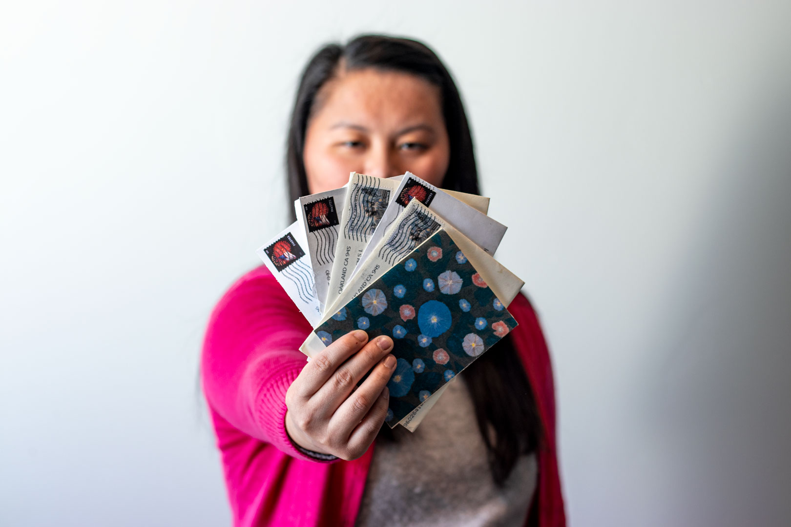
This is the background I used for my movie poster. I wanted to stick with the white, but I couldn’t find a notebook-style background. I found this background off of a free photo website called www.pexels.com.For the poster, I used a blur filter to enhance the depth of field that was displayed on the photo of me.
“To me, photography is an art of observation. It’s about finding something interesting in an ordinary place… I’ve found it has little to do with the things you see and everything to do with the way you see them.”
— Elliott Erwitt
